
Color
And how I use it.

I talk a lot about color. I’ve also talked about how it frustrates me when other artists talk about color in generic or vague terms. Specifically, the phrase “I love color!” Cool. I equate this with loving everything. Everything has a color. (Just like everything has a temperature, but I digress.)
What about color do you love? I want to know specifics – go deep!
Therefore, if I want you to tell me more, I should tell you more, right?
There are two main things I love about color or using color: the first is that color is relative and the second is using odd color pairings.
“Color is relative” is not new and has been studied by many people and many artists know that color is relative. I think it is something that every artist should investigate in their own way, using their preferred medium. I tend to look at these interactions with fabric and paper.
In many ways, investigating color relationships with fabric is the same as with collage papers. Granted you can paint a piece of paper any color you want pretty quickly so it isn’t quite the same in that aspect, but the way I approach collage is to use origami paper to design a composition to then scale up into a fabric composition. I have not yet gone down the painted paper rabbit hole. Maybe one day….
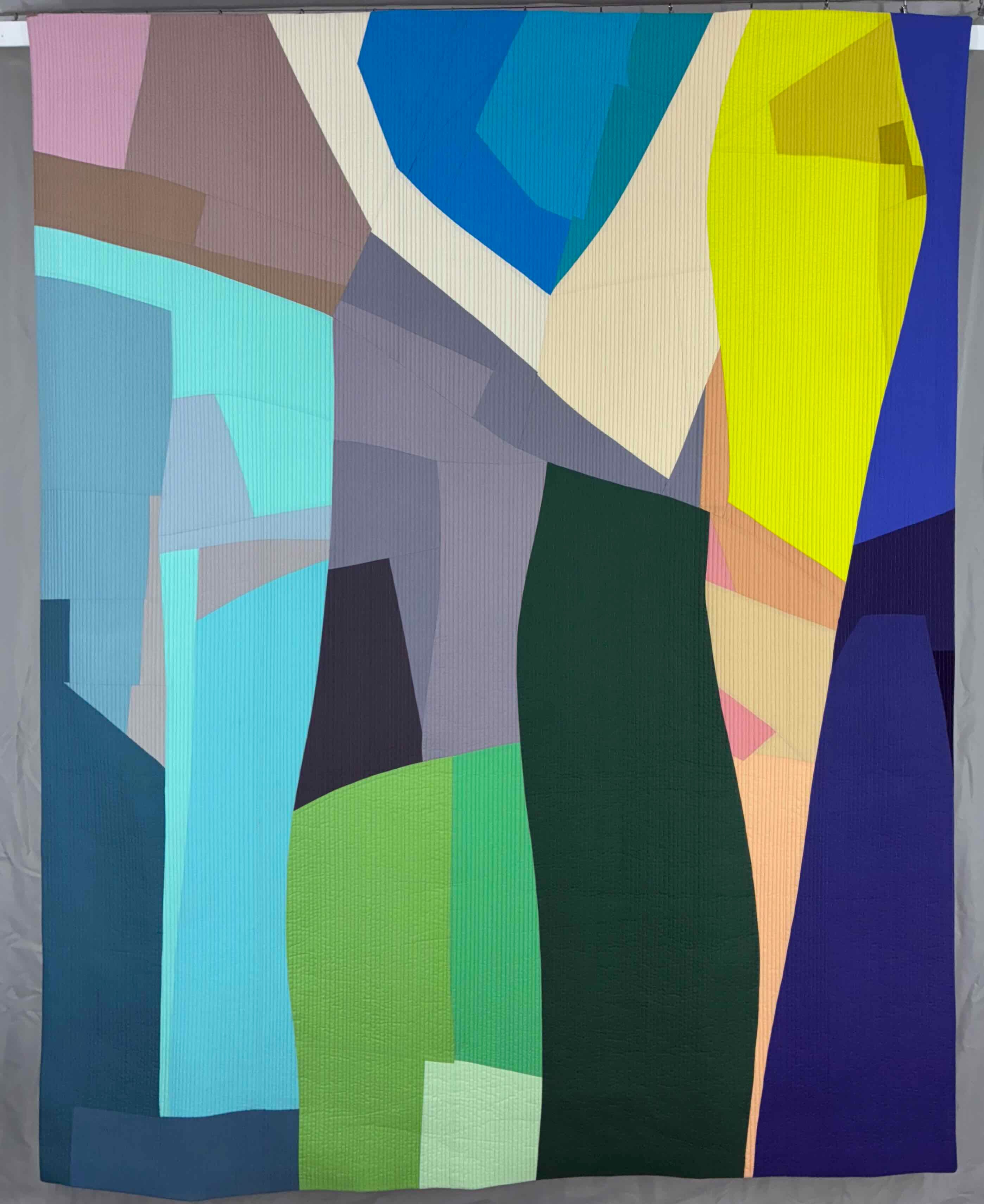
Getting back on track – I like to use the same color in the same composition next to different colors to see how is changes. For example, below is a piece I’m working on that will likely be Vertebrae 9. I assure you, the center column of each vertebrae piece is roughly the same color and value in each of the three different vertebrae. It looks different though, based on the colors surrounding it.
The center column in the vertebrae piece on the far left doesn’t emphasize the blue central column as much as the central column that is surrounded by very dark values. That is what I geek out about! How cool is that?? Same color and value but totally different feel in each one.
Depending on what color is next to it a color can go from being dull to being bright or maybe the hue appears to change.
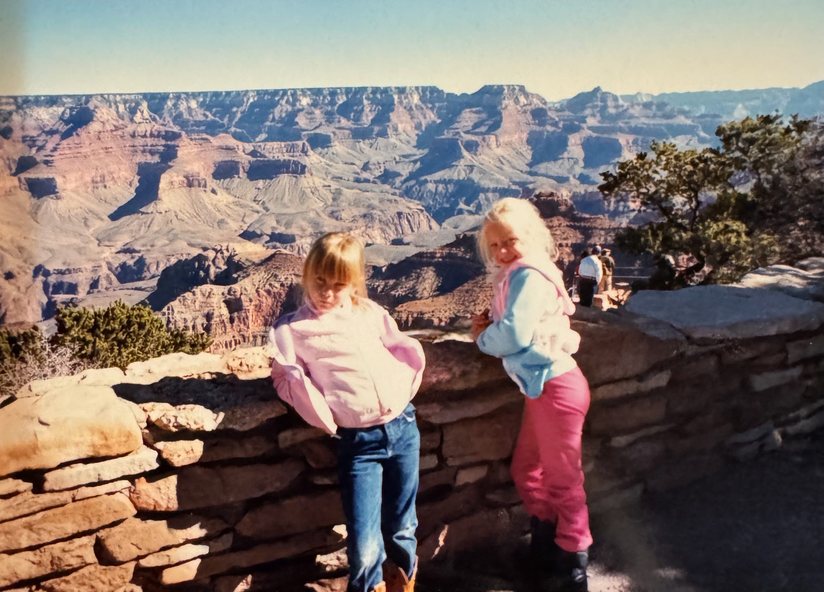
Moving on from color theory, let’s talk about color use. This is the really good stuff. How an artist uses color is as much a part of their voice as the subject matter or medium they use. I was born in October 1979. My first impression of colors and prints was the 1980s. My first ten years was steeped in neons, pastels, jewel tones, and parachute pants. I don’t think it gets any better than that. I will take no feedback on the 1980s being the best color decade. I said what I said.
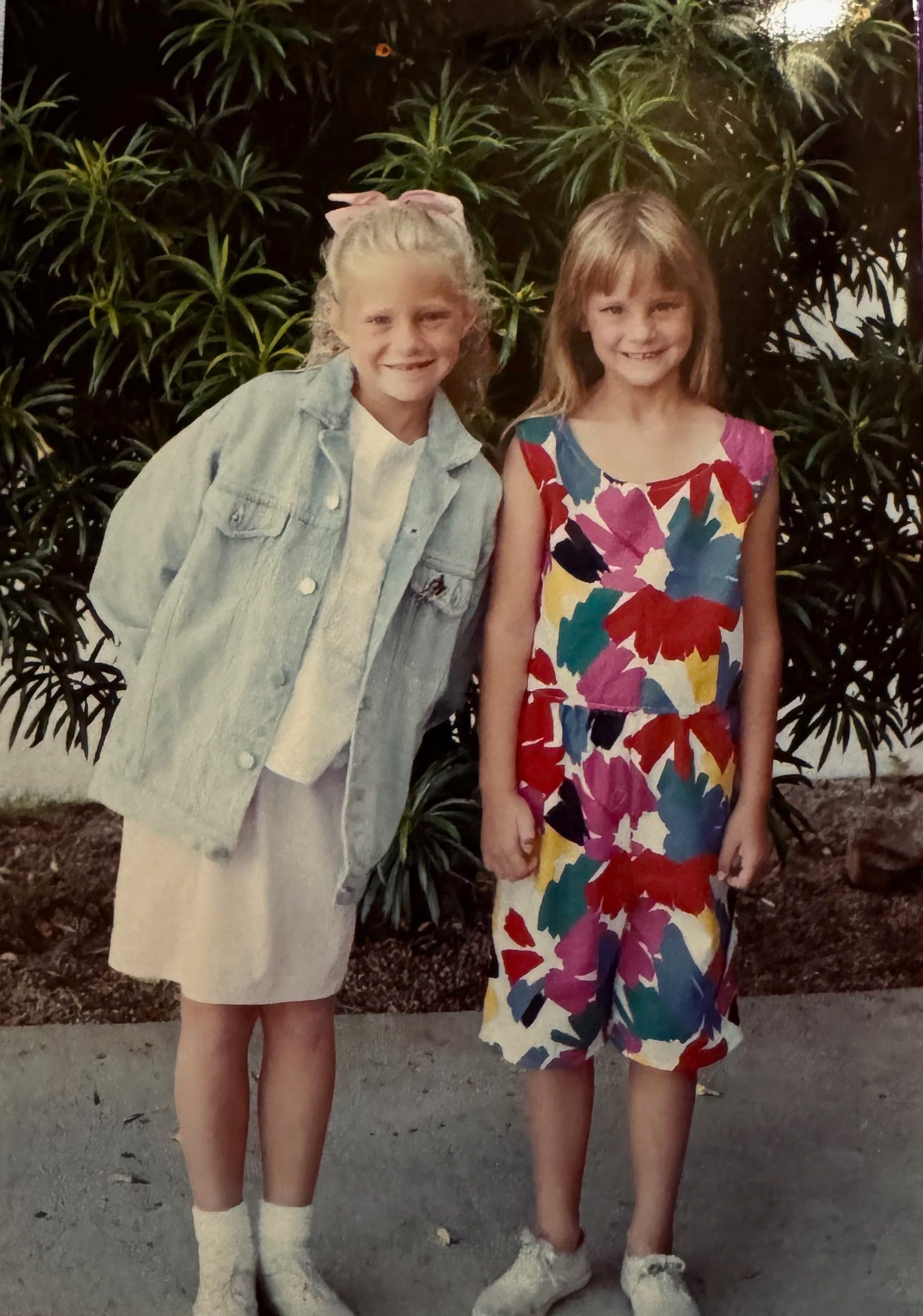
Look at these adorable kids: one in pastels and the other in a wacky bright print. I think my mom did a pretty good job dressing us. Also, she made my sister’s outfit. We had a bunch of these matching shorts and top outfits. We wore the hell out of them!
We also lived in Arizona which I think also imprinted on me (see below regarding the color brown).
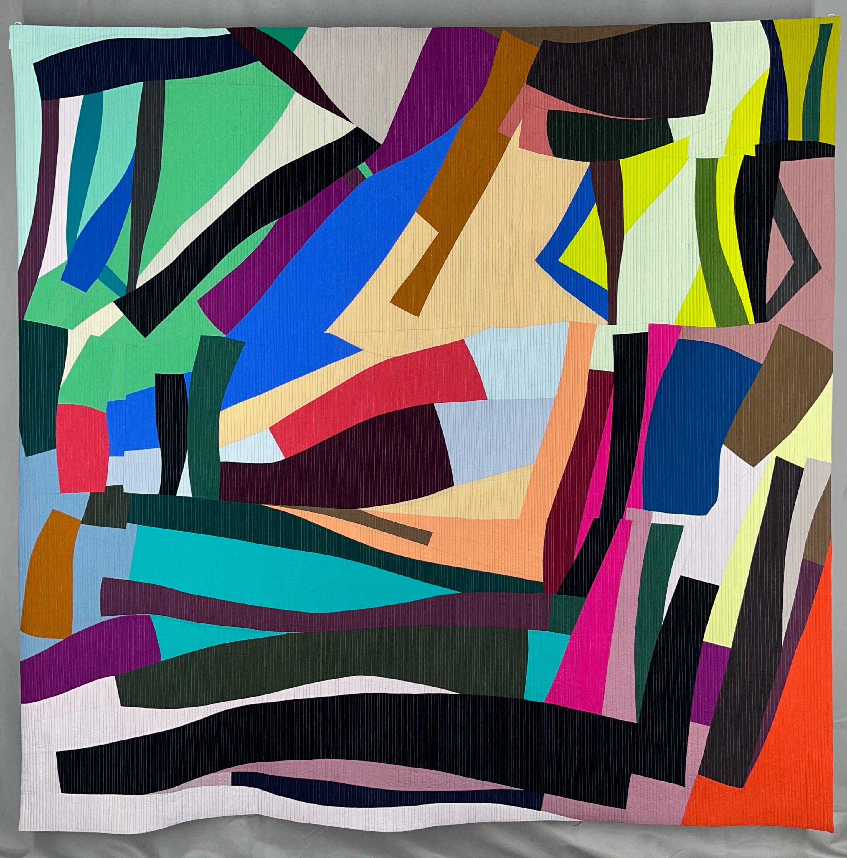
Using colors together in an unconventional way is very much a part of my voice. For example, Calcium Carbonate Structures 3 has this acid yellow next to a purpley blue and salmon. That salmon is a little meh on its own but it makes the acid yellow and purpley blue sing. It is also unexpected. I’m not sure I know any other artists that would put them together.
I think one of the best examples of my color voice is displayed in Fluid Dynamics 1. I love the pops of bright colors next the muted pastels.
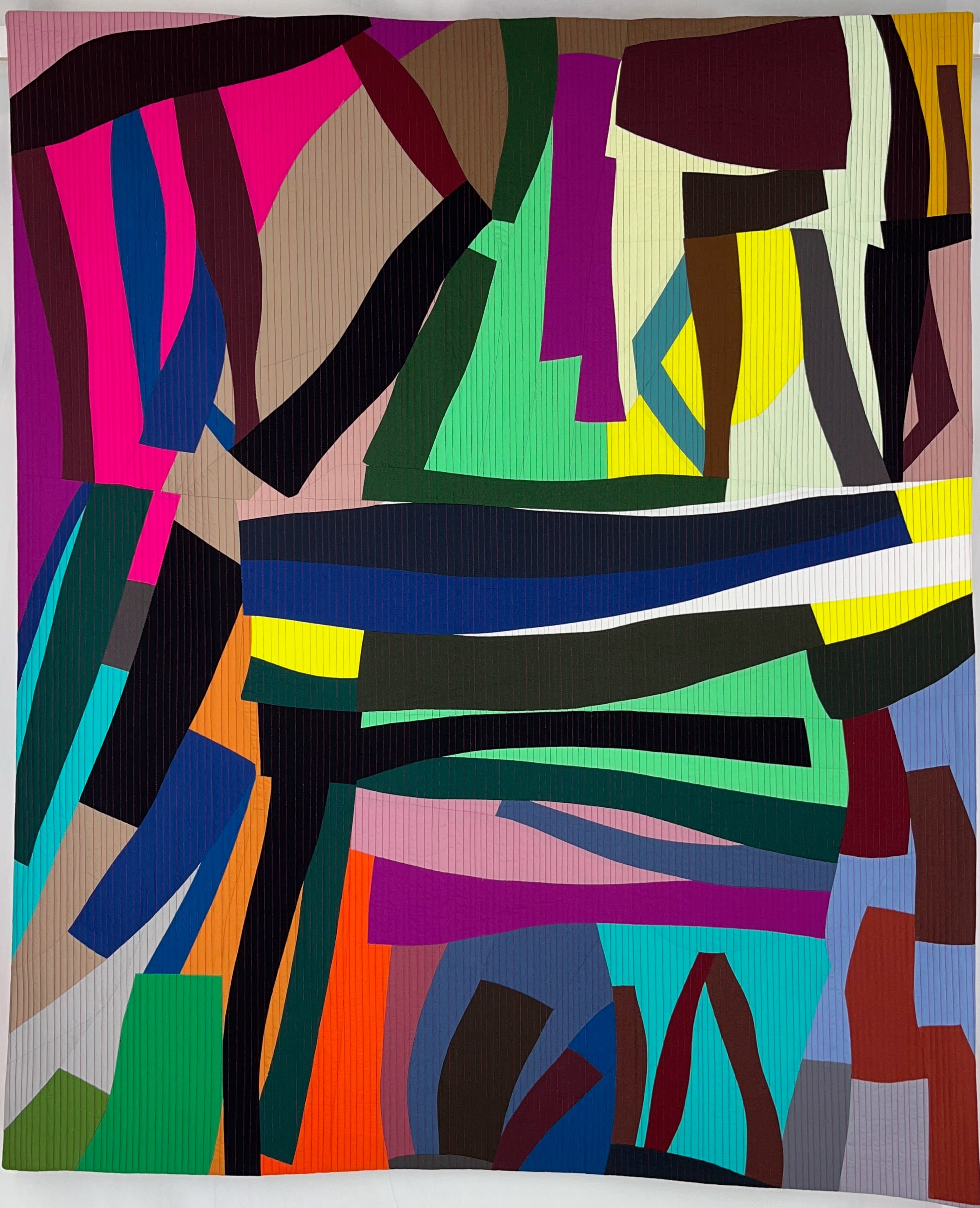
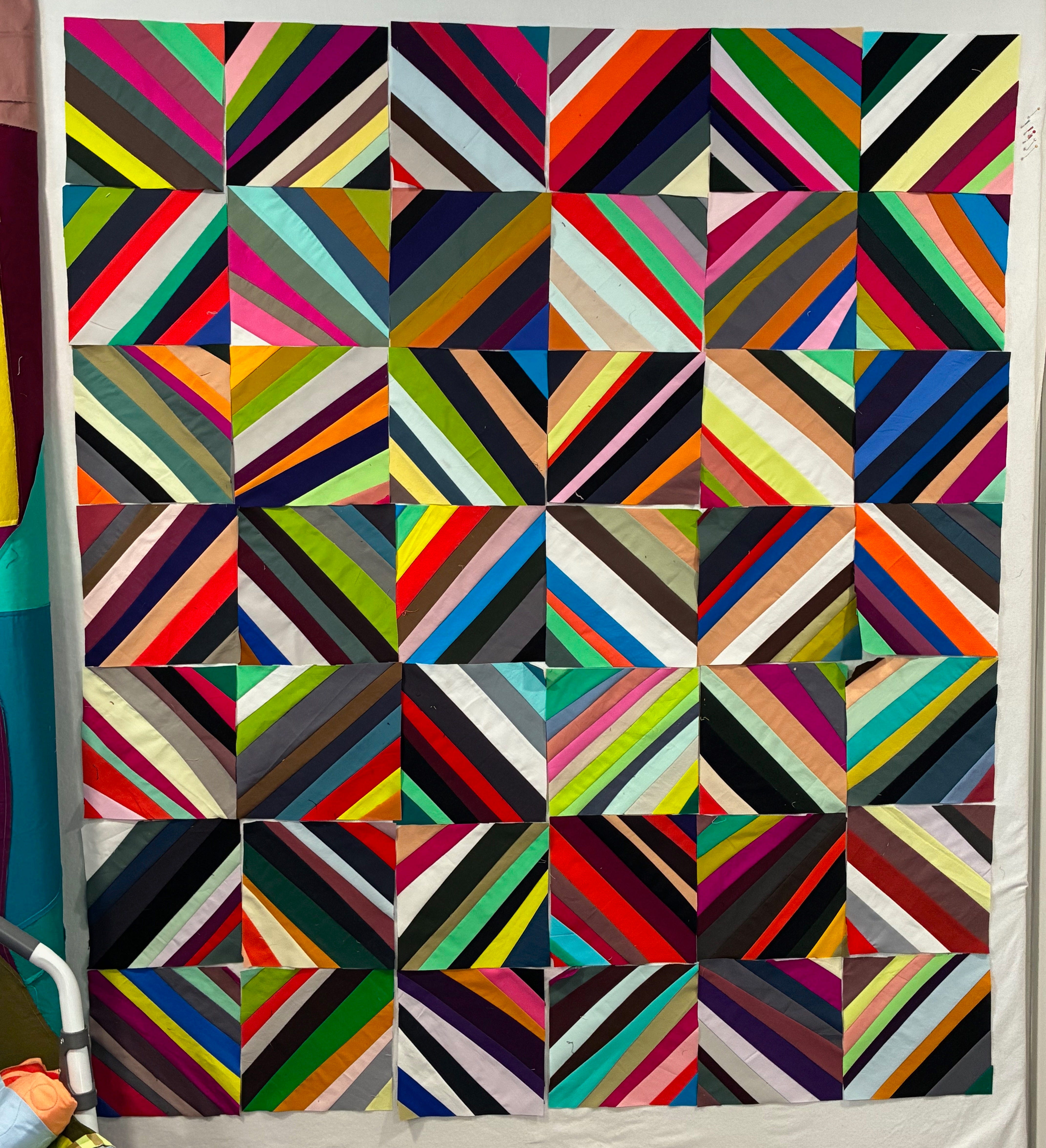
Another favorite for weird color combos is Vertebrae 5. For this piece I used five variations of the same color combinations and tried to push the limits of each color. You can see I used “orange” in all of them but can you really call each of the “oranges” orange?
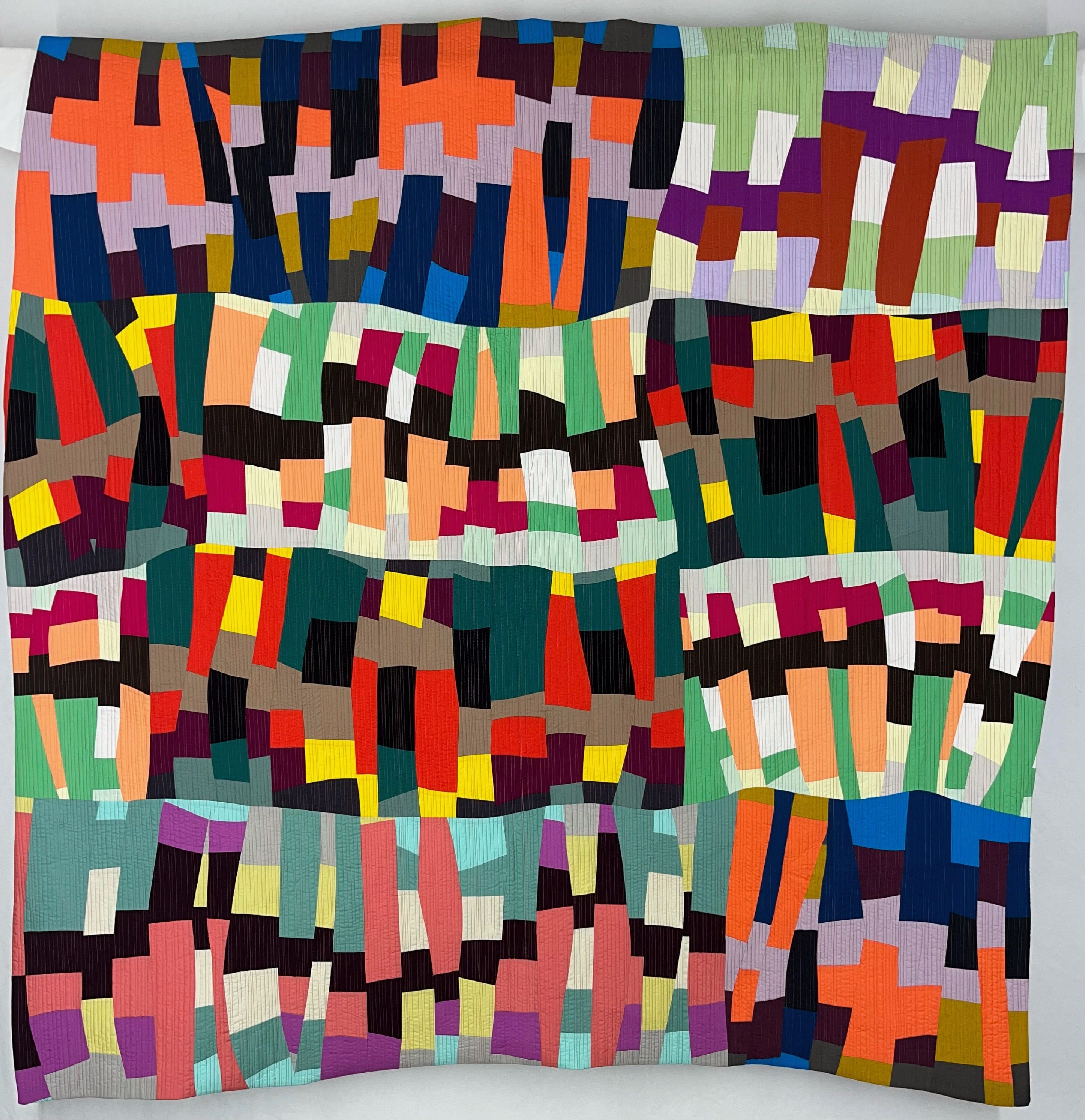
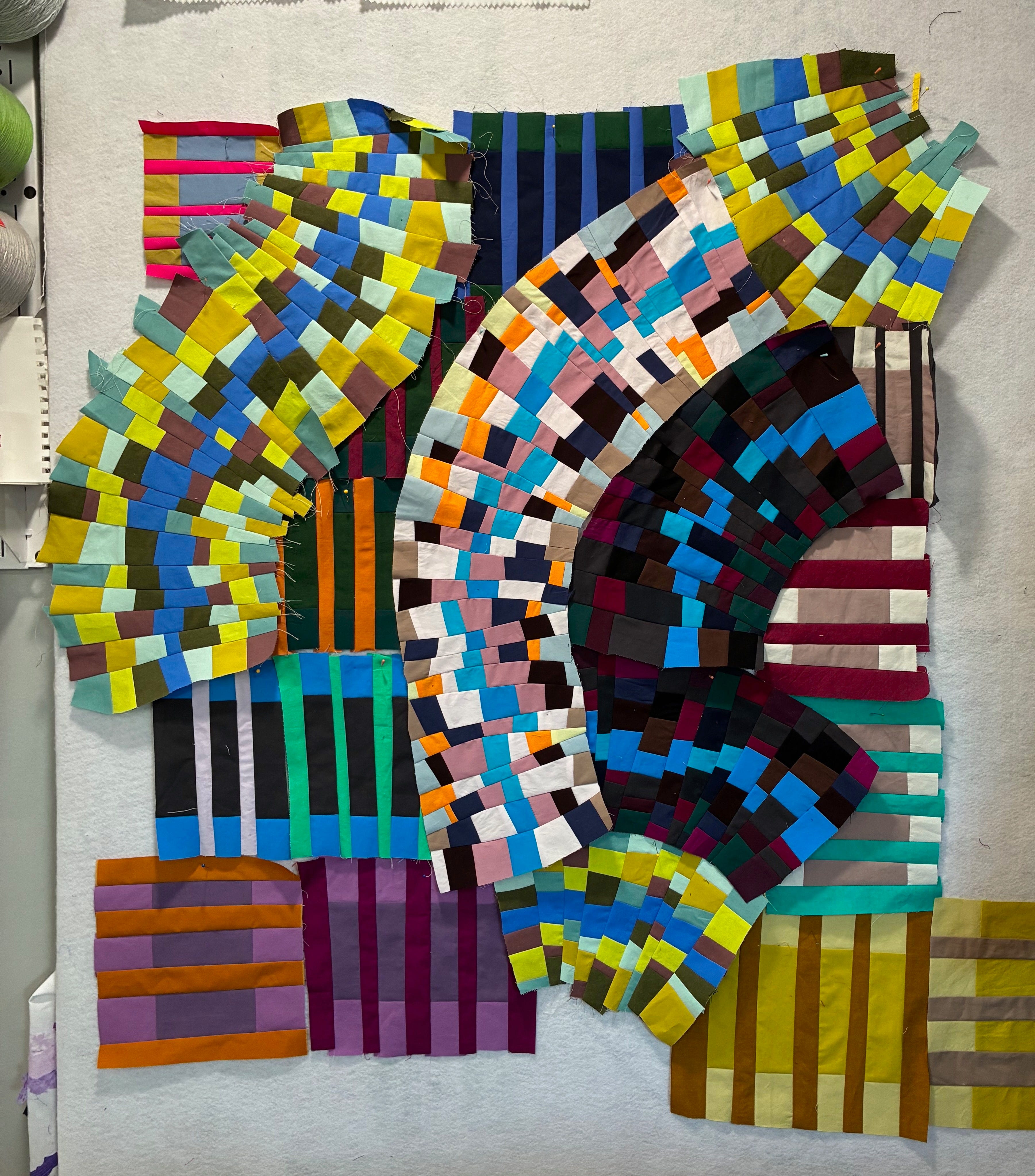
And finally, the unsung hero in almost all my work is brown. Light taupe to chocolate, they all get used and really do some heavy lifting. They complement every other color. I have not found a color that doesn’t look amazing next to brown. Below are a few examples of how at first glance you don’t see the browns or how much there is but once you do, you realize just how important they are.


